Case study

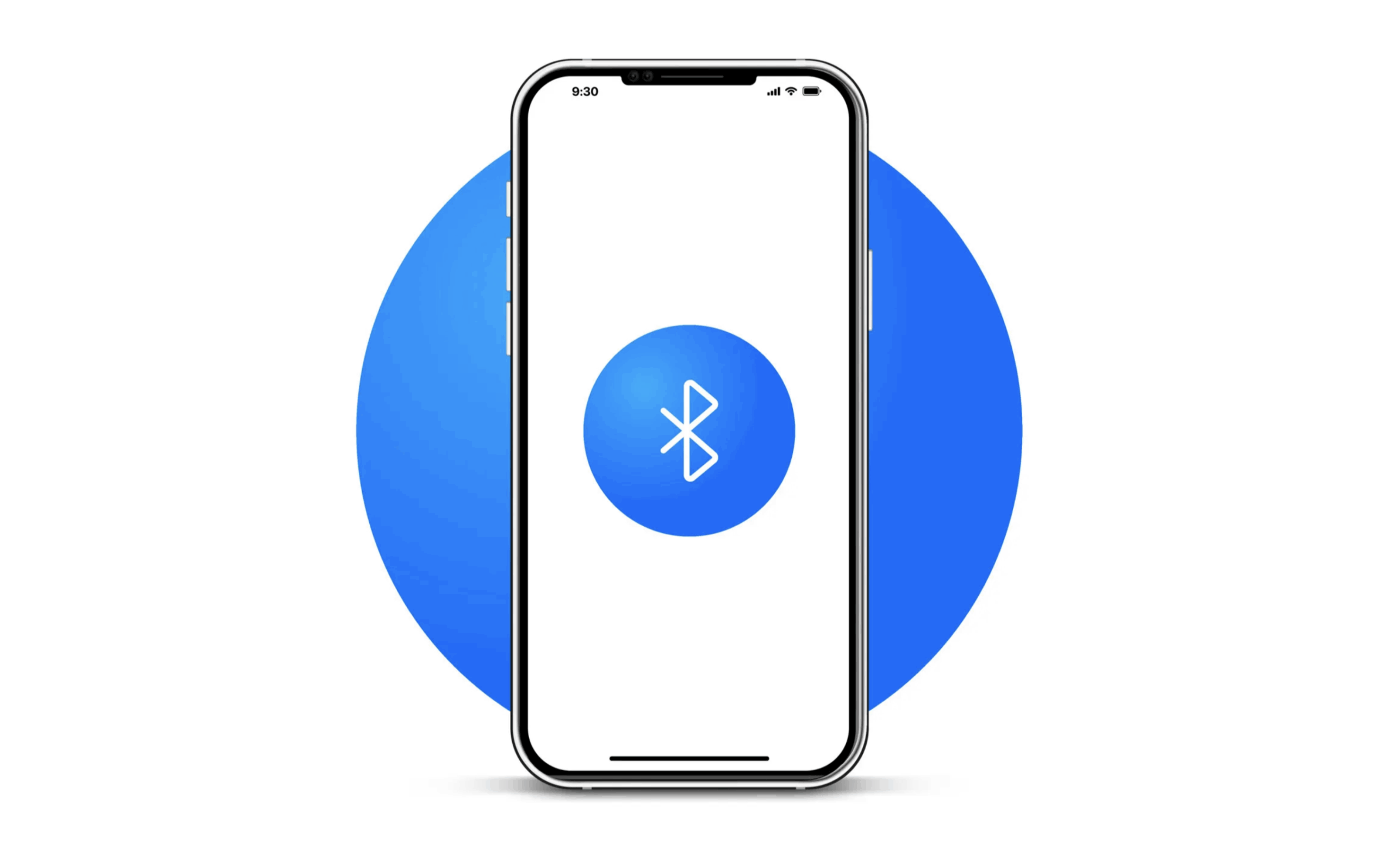
The Bluetooth symbol and branding UX.

In the world of UX design, iconic symbols and branding play a pivotal role in shaping how users interact with technology. These symbols, often simple in form, transcend language and cultural barriers to communicate complex functions or experiences at a glance.
Take the Bluetooth logo, for example: a minimalist emblem that has become synonymous with connectivity. Whether you’re pairing headphones, linking smart devices, or syncing speakers, the Bluetooth symbol immediately conveys the action, simplifying the user experience. Such logos go beyond mere branding—they serve as universal guides that make accessing features intuitive, reducing friction in our daily interactions with technology.
"From Viking King to Global Connectivity: How Harald Bluetooth’s Legacy Powers Modern UX"
The Bluetooth logo is a perfect case study in the power of simplicity in design. The logo itself, a unique combination of the Nordic runes for “H” and “B” (representing Harald Bluetooth, the Danish king who unified parts of Scandinavia), forms a stylized "B" glyph that is instantly recognizable.

Its sleek, minimalist form conveys not only a letter but also a concept—connectivity. The logo’s distinct shape and its blue-and-white color scheme create an intuitive visual identity that users immediately associate with the action of pairing devices. Whether it’s connecting your phone to a speaker, linking wireless earbuds, or syncing a smartwatch, the Bluetooth symbol has become a universal shorthand for device communication.
Bluetooth technology was named after a Viking king by the name of Harald “Bluetooth” Gormsson who died over 1,000 years ago. He unified factions of Denmark with those in Norway much like how the technology we use today unifies different electronic devices. The Bluetooth logo is also a combination of the Nordic runes for his initials—H.B. As for how he got his nickname in the first place is up todebate. Some sources say that he loved to eat blueberries, which permanently stained his teeth blue. Others speculate that he had a dead tooth, which had a dark blue/grey color  - Source: national_archaeology
The simplicity of the design allows users to instantly grasp its meaning, turning a once-complex task of configuring wireless connections into a seamless, everyday experience. The Bluetooth logo stands as a powerful example of how a well-designed icon can transcend its visual form and directly embody the user’s intended action.

Uber ingenuity

In UX design, iconography serves as a critical tool for simplifying user interactions. Universally recognizable symbols allow users to navigate digital or physical interfaces without relying on language, reducing cognitive load and making experiences more intuitive.

When a symbol conveys its function at a glance—like the Bluetooth logo does for connectivity—it eliminates the need for explanations, transforming complex actions into effortless tasks. Companies like Uber are striving to achieve this same level of instant recognition. With a simple, clean wordmark and its distinct, bold "U" icon, Uber seeks to become synonymous with mobility, just as Bluetooth has with connectivity. Whether in a new city or using the app for the first time, users can instantly recognize the Uber logo and understand its purpose: to get a ride. As brands like Uber refine their visual identities, they aim to create associations that transcend language and culture, making their services as intuitive and accessible as universally recognized icons like Bluetooth.

Just google it!

In the same vein, the importance of universally recognizable symbols cannot be overstated, as they streamline interactions by eliminating guesswork and guiding users through interfaces with ease. The Google logo is a prime example of this in action. Whether it’s the colorful “G” icon or the full Google wordmark, the brand’s simple and consistent design is instantly recognizable across the globe.

More than just a logo, it represents an entry point to information, services, and tools that people rely on daily. Whether accessing Google Search, Maps, or Drive, users intuitively know they are interacting with a trusted source of information. By maintaining a clear and consistent visual identity, Google has created an ecosystem where its branding communicates reliability and accessibility, instantly guiding users to their desired actions.

Like Bluetooth for connectivity, Google has achieved a level of brand recognition that transcends language, allowing users to navigate complex digital landscapes with confidence and ease. Google’s approach shows how effective iconography not only simplifies interaction but also fosters trust in user experience, creating a visual shorthand that integrates seamlessly into daily life.

Bluetooth connected!-The brand transcendence concept

Bluetooth is a perfect example of brand transcendence, where a logo becomes universally recognized and functional without being tied to consumer-facing branding. Unlike tech giants like Google or Apple, Bluetooth isn’t a company that markets directly to the public. Yet its logo, a simple blue-and-white glyph, is instantly recognizable across devices and industries.

It serves a clear, specific function—enabling wireless connections—without requiring users to know the technology’s origin or the organization behind it. This is a key aspect of brand transcendence: the logo itself becomes a tool, a functional symbol that facilitates action regardless of the brand’s visibility. Users don’t need to understand the technology's inner workings or the history of the Bluetooth Special Interest Group; they simply see the symbol and know they can connect devices, whether it’s headphones, speakers, or smartwatches. This transcends traditional branding by allowing the logo to seamlessly integrate into countless products, making Bluetooth not just a recognizable mark but a universal language for connectivity. The success of this symbol demonstrates how thoughtful design can elevate a brand’s impact beyond recognition and into the realm of everyday utility.
"Designing with Purpose: How Simple Icons and Branding Drive Intuitive UX"
When applying the concept of iconography and branding to UX design, simplicity, clarity, and functionality must take center stage. To create icons that instantly communicate a function—whether it’s paying, requesting a ride, or searching—you need to focus on visuals that are universally understood. A payment icon could be represented by a simple credit card, a ride request by a car silhouette, or search by a magnifying glass. These are instantly recognizable symbols that trigger the right user action without explanation. The key is to make sure the design is intuitive and doesn’t require interpretation; users should immediately grasp what the icon represents.

Prioritizing clarity and universality in design means creating visuals that resonate across cultures and contexts. For example, the Bluetooth logo works globally because it is simple and its meaning transcends language barriers. Similarly, icons in UX should be universally understood, reducing the need for localization or added instruction. They should serve as guides that enhance the user’s ability to complete tasks, whether it’s on a mobile app, website, or physical device interface.

Additionally, it’s essential that branding supports the user experience rather than overshadowing it. In UX, the goal is not for the logo or brand to be the focal point, but for it to reinforce the functionality it represents. Overly aggressive branding can detract from the experience by becoming distracting or confusing.

Take Nike, for instance: while the swoosh symbol is widely recognized, it no longer strictly represents basketball, expanding to lifestyle and other sports. This kind of brand evolution shows how a brand can grow, but in UX, the logo should remain closely tied to the core function to avoid losing its association with specific actions.

In contrast, brands like Caterpillar retain their functional association with durability and ruggedness across their product lines. Whether it’s work boots or earth-moving vehicles, the Caterpillar logo immediately signals reliability and toughness. This is a key takeaway for UX design: the branding should always reflect the intended user experience, ensuring that the visual identity aligns with the action the user is trying to perform.

By balancing clear iconography with branding that enhances rather than overwhelms, you can create intuitive and functional designs that resonate with users across contexts and cultures.
Making the world a better place through constructing elegant hierarchies.
Tawanda Mapondera